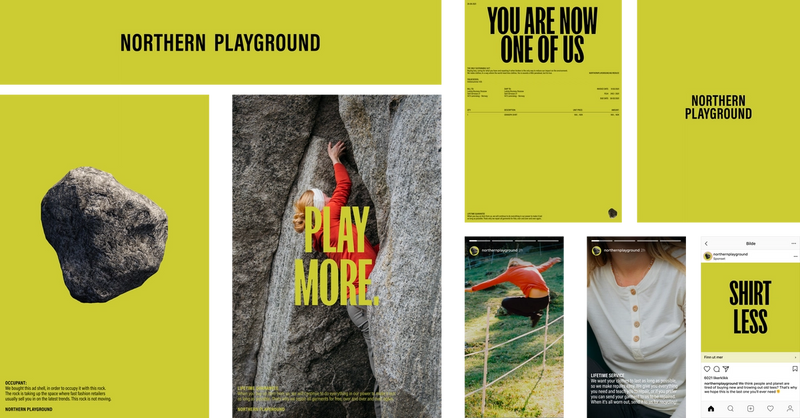
Over the past couple of years we have really found ourself. We have gone from a goal of selling as much as possible to the exact opposite: reducing consumption. While we have updated our message, our visual identity has been hanging in the past. Together with the company Iterate, we did something about that.
With a vision of reducing the world's clothing consumption, it is important that you don't solely see us as a clothing brand. We must change the existing pressure around buying new things, and are therefore raising our voice so that people listen. We want to challenge the norm. We are a rebel.
Typography
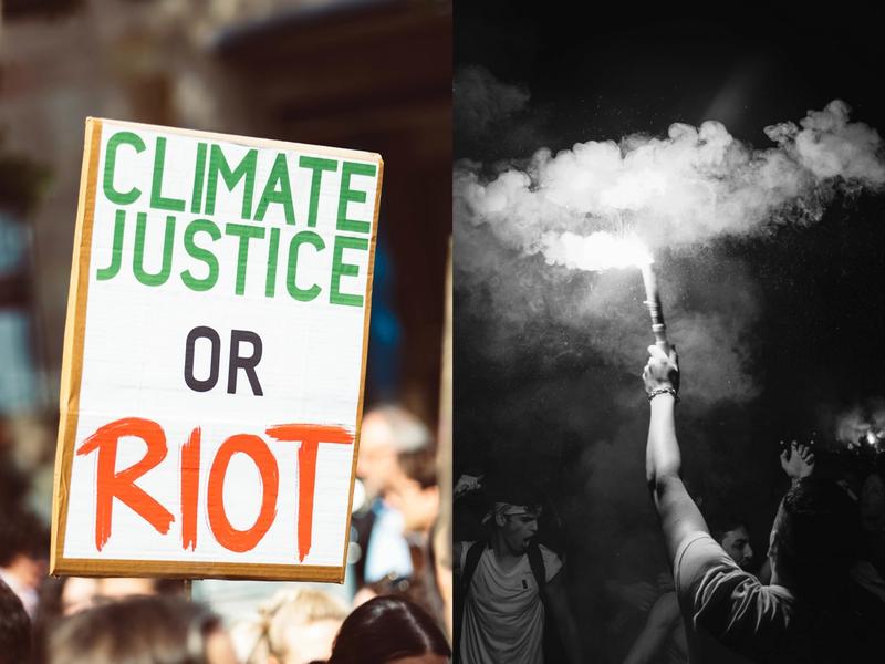
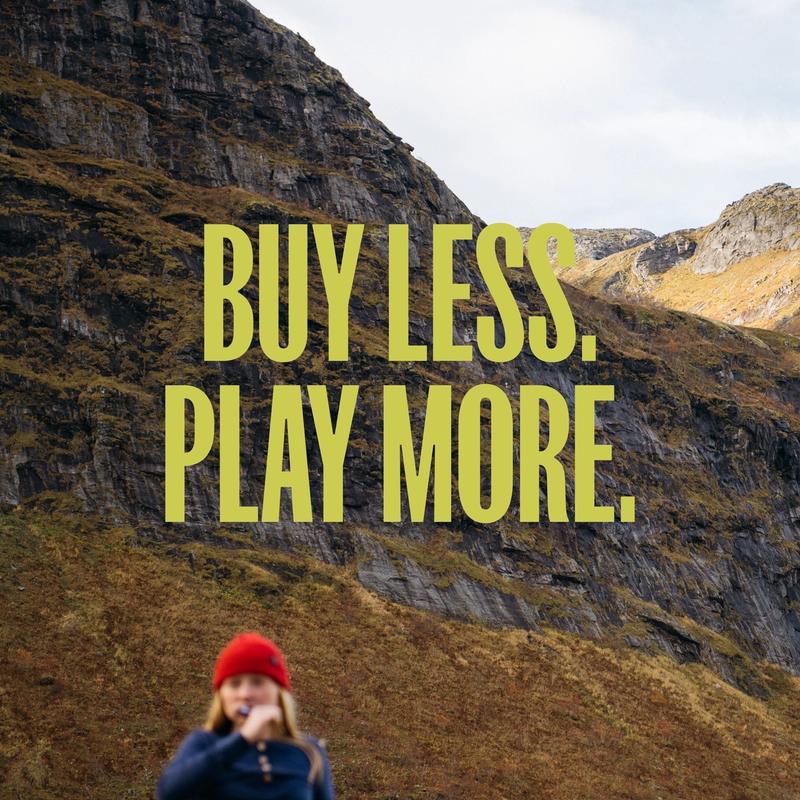
We found inspiration in protesters and their posters to find the perfect typography. Similar to these posters, our identity is also characterised by large words and strong messages.
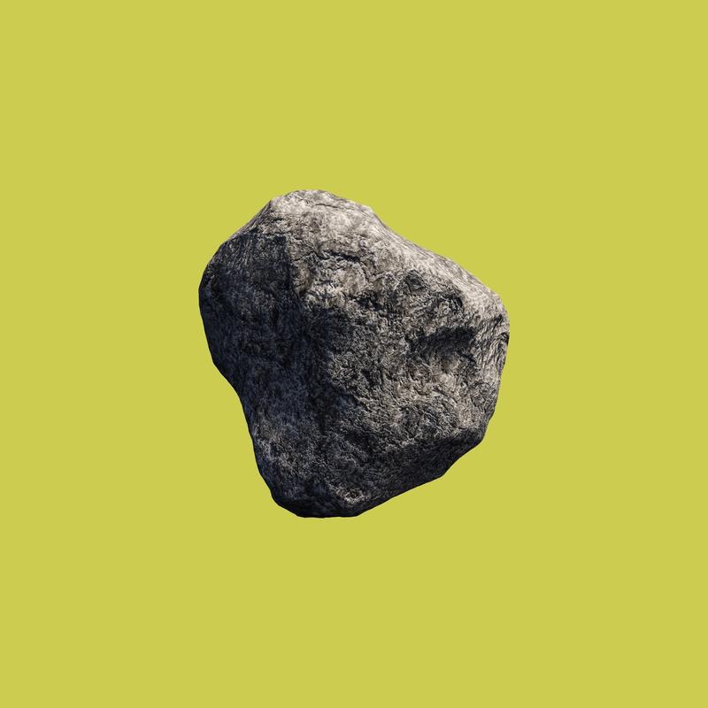
Logo symbol
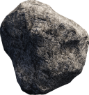
Northern Playground is an opposite to everything established in the clothing industry. That was why it was important for us to have a logo the symbolised something slow and real, instead of fast and hip. The Norwegian grey stone does the trick. When we thought of the stone, we fell for it because it is strong and real, it wears slowly and because it is the rebel's symbol. We are a stone in the shoe of the industry and won't back down until they listen.
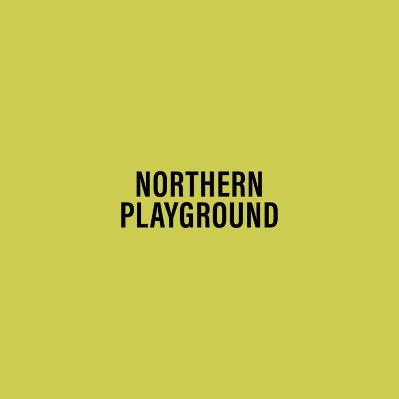
Color
We were inspired by the lichen that decorates the simple, Norwegian grey stone. We knew that we wanted to be green, but that we couldn't land on a comfortable, basic, environmental green color. Similar to our font we must be bold and capture your attention with our color.
